> Since that button down there is called "Start", it implies that you can probably do something with it, maybe start programs? Click and you'll see the Start Menu:
Over time it seems like a lot of designs stop feeling the need to lead the user in this way. There is an assumption that by now everyone knows what the menu in the bottom left corner does, and we are no longer in the phase of trying to teach the population to use a computer for the first time.
I feel like this is the wrong approach. Every day there are new young people using a computer for the first time. Wouldn’t it be nice if all these conventions that evolved over the past 50 years could be intuitively discovered, instead of needing explanations from someone who already understands them?
Of course, as the world becomes more digital, many skeuomorphic designs become more abstract to those same young users. The floppy disk, the traditional telephone, even the file folder.
I was a wee little kid when I first touch windows 95, and only ever used dos before.
The "Start" button made no sense. The computer was already started, and clicking randomly popped up menus and opened documents in their right programs, so it felt like the natural way to progress. The owner of the computer had to point me to the start menu.
Even now I still think it was a cursed UI. It was the place primarily to close and shutdown the computer (again, when you see that button the computer and OS will always be already started), get to the control panel or run commands. None of it felt like "start", and the current windows logo only design makes a lot more sense.
To your point, small kids get proficient very fast with smartphones and iPads. I'd call their interface a lot more "intuitive"
The Windows 95 UI designers wrote a paper going over their design methodology and how they incorporated feedback from real-world users at a variety of levels of computer proficiency into their design. https://dl.acm.org/doi/fullHtml/10.1145/238386.238611
For example, the reason for the single "Start" button in the taskbar was that they initially had multiple buttons for different specific purposes, and relied on a "Programs" folder on the desktop for launching programs, but found that this design didn't hold up in testing:
> Users had considerable difficulty deciding what each of the three buttons on the Tray was for and later had trouble remembering where to go for a particular command because their functions overlapped in certain contexts (e.g., to find something in Help, do you go to Find or to Help?).
> Users of every type were confused by the Programs folder. We thought that having a folder on the desktop with other folders and links to programs inside it would be a natural transition for Windows 3.1 users accustomed to Program Manager, while being relatively easy to learn for beginners. We were wrong! Beginners quickly got lost in all of the folders and other users had a lot of trouble deciding whether they were looking at the actual file system and its files or just links to actual files.
> The results from these studies and interviews greatly changed the design of the Windows 95 UI. In the early Windows 95 prototype, we had purposefully changed some things from Windows 3.1 (e.g., the desktop was now a real container) but not others (e.g., File Manager and Program Manager-like icons on desktop) because we were afraid of going too far with the design. We were aware that creating a product which was radically different from Windows 3.1 could confuse and disappoint millions of existing users, which would clearly be unacceptable.
> However, the data we collected with the Windows 95 prototype and with Windows 3.1 showed us that we couldn't continue down the current path. The results with beginning users on basic tasks were unacceptably poor and many intermediate users thought that Windows 95 was just different, not better.
> Beginners quickly got lost in all of the folders and other users had a lot of trouble deciding whether they were looking at the actual file system and its files or just links to actual files.
TBH, I often have no idea whether anything is really a file/directory or some fake thing in Explorer, and this aspect has gotten worse over the years. Now they make it hard for users to find their home folder and present a bunch of virtual things that are confusing. Home, Gallery, Music, Videos - all virtual apparently. Moving things into OneDrive that used to be in the home folder. The Downloads folder, if clicked from the side panel, doesn't have a path, etc.
> Home, Gallery, Music, Videos - all virtual apparently.
Huh? I agree with you that in general it's a mess. (found it fascinating that the hierarchy that Explorer shows is technically not the file system - It's its own thing which works more like the unified directory tree in Linux, complete with mount points and different "virtual file systems". The real file system is only a part of it)
But the Gallery, Music, Videos etc subfolders are AFAIK ordinary folders that just have custom icons and localized names. For reasons I don't understand, Microsoft would like users to forget the home folder exists and only work with those preassigned directories. But that's just a convention and a bunch of UI nudges. The home folder is still there and can be used without problems.
At least that was the case before the aggressive push for OneDrive started. They might have changed it since then...
I understand their research...and at the same time, looking at the Macintosh interface, Apple came up with something often touted as better and more user friendly while offering a different paradigm.
It feels like the Windows UX designers came up with the local optimum for the UI they were willing to try, but didn't go beyond.
The Macintosh interface was designed around running a single program at a time, multi-tasking was shoehorned in later on. The Windows 3.1 interface is a lot closer to the Macintosh interface than the Windows 95 interface is, so I think a lot of the Windows 3.1 feedback regarding multitasking and UI navigation applies there too. When Apple had the opportunity to redesign the UI for Mac OS X, they added the Dock, which is functionally similar to the Windows taskbar.
> In Windows 3.1, beginning users took over 9 ½ minutes, on average, to locate and open a program that was not immediately visible. Results were not much better for our Windows 95 prototype. These results were clearly unacceptable, given that our market research data (and common sense) told us that starting a program was users' number one task.
> Beginning users and some intermediates had a lot of trouble using the mouse, especially double-clicking. As a result, they often failed to find things in containers when the only way to open them was double-clicking.
> Beginning users and many intermediates relied almost exclusively on visible cues for finding commands. They relied on (and found intuitive) menu bars and tool bars, but did not use pop-up (or "context") menus, even after training.
> All but the most advanced users did not understand how to manage overlapping windows efficiently. Beginners had the most trouble-when they minimized a window, they considered it "gone" if it was obscured by another window. We heard many stories from educators (and witnessed in the lab) how users caused the computer to run out of RAM by starting multiple copies of a program instead of switching back to the first copy. Intermediate users were more proficient but still had trouble, especially with Multiple-Document-Interface (MDI) applications such as Program Manager and Microsoft Word. Market research data confirmed the problem by revealing that 40% of intermediate Windows users didn't run more than one program at a time because they had some kind of trouble with the process.
> Beginning users were bewildered by the hierarchical file system. Intermediate users could get around in the hierarchy, but often just barely, and usually saved all of their documents in the default directory for the program they were using. This problem (especially the novice case) was also observed with Macintosh users.
It's where you start every activity and process. "Start to shutdown the computer" "start to run a command" "start to run a program" "Start to change some settings". It in the passive voice describes what you are going to be doing in there: Starting some activity, process, program, change, access, whatever.
Start > Programs > Maxis > SimCity 2000 is psuedocode for what I just did. I started a program by Maxis called SimCity 2000
Four Squares in a Grid Button > All Apps > EA Games > Sim City 4 describes crap I'm clicking on in the UI, nothing about what I'm doing.
To make a real world comparison, I have a single closet in a my room with a lot of stuff in it. Would sticking a "Start" label to say "Start > first aid > bandaid" help that much ? Someone coming to my home could as well just try to open the closet randomly, the more important thing is it looks like a closet that can be opened.
That's where I prefer the Grid button, as it just looks like a button (and it could still look more like a button TBHO)
I never liked the word "start" itself, but if you're going to have a GUI, a single central clean place to say "every interaction you may want to do can be found from here" is a good idea. In principle having search there is pretty useful.
In practice Microsoft has consistently from the beginning gone out of their way to make the search useless and slow, a policy that is now old enough to vote. How the start menu has now gone nearly two decades without you being able to type "note" and see Notepad just pop up as one of the choices instantly beats me on my ever-more-super super computers, but that's an implementation detail that Microsoft has consistently botched. And more and more over time, Microsoft has thought more about what they want in the menu than what the user wants.
Nevertheless, the general idea of that top-level "here's everything" is a good one. The open source desktop environments do a much better job with it, without marketing trying to figure out how to stuff this half-decade's marketing push on to the user or "monetize" it.
> There is an assumption that by now everyone knows what the menu in the bottom left corner does
Except that... it's no longer in the bottom left corner! Recently, I had to help a relative with a Windows system, and what passes for the "Start" button has now moved to somewhere more in the center (and, of course, this completely confused my relative, who was used to the old place). I also had to rant about Fitt's law (without mentioning its name) and how things were better the way they were before. And I also had to find out and show them where the shutdown button ended up this time, so they could power off the computer normally (as they were used to) instead of having to use the power strip switch.
And the issue I had to help with? Windows was too slow (to the point of nearly unusable). They don't use the computer often (and obviously always power it down after each use), so it's always running some heavy background update (on a mechanical hard drive) whenever it boots up. My advice was to power it up and let it sit for about an hour before using, then it would be back to normal speed.
You could've changed the setting that puts the button back on the lower left corner and saved your relative the trouble.
The new default is truly terrible, though, and this was the first setting I had to change when I was forced to use a windows laptop by the company I work in.
> You could've changed the setting that puts the button back on the lower left corner and saved your relative the trouble.
Nice, I didn't know that was possible; I expected it to be unchangeable, since I heard that the whole taskbar is no longer customizable in newer Windows releases.
Last time I used Windows 11, maybe late last year, there was no way of doing that… though they had finally allowed you to turn off the source of ads (“widgets”) which they put in the corner instead.
> There is an assumption that by now everyone knows what the menu in the bottom left corner does, and we are no longer in the phase of trying to teach the population to use a computer for the first time
Strong disagree, because:
> Every day there are new young people using a computer for the first time
I can assure you these people have no idea what the start button is or does... it doesn't help that it no longer even says "Start" for the last ~20 years.
We do agree. I said the first thing you quoted was the wrong approach, because of the second thing you quoted. Having it say “start”, like it used to, would help solve that.
For people complaining that "Start" isn't a great choice, perhaps there's something better, but I can't think of anything. You need a small word that implies, "Click here to do something or find something." and in that regard, I think "Start" is a good choice.
On the other hand, I think there were few ideas worse than "My Computer", etc., not the least of which is the fact that it took Windows application software about 10 years to get consistently good at handling paths with spaces in their names.
Of course, the worst UI thing Microsoft ever did was hiding file extensions by default. That might be the worst UI decision in all of history.
> That might be the worst UI decision in all of history.
The Windows 8 touch-first start menu with a hot corner instead of a button, applied to their Server OS, that I assume most accessed through RDP was pretty horrific.
> the worst UI thing Microsoft ever did was hiding file extensions
Highly disagree... that was not a snap decision and they did a lot of research on it. The vast majority of people were only further confused by extensions, and preferred file names to appear more natural. This was also done before the days of widespread use of the internet, email, or viruses/malware.
What research have you done that might suggest a large number of people would agree that it was a bad decision?
Ok but, were you around during that time? I remember it not helping much at all to tell people what to do.
When Windows 95 first came out, they had to have a giant arrow pointing to the Start menu with an explanation of what that would do: https://a.imagem.app/Ge6OCZ.jpeg
Then they had a scrolling animation with an arrow and some text ("Click the Start button to begin") that slid in from the right side of the taskbar and pointed right at the Start button.
I was around, though I wasn’t an adult where I was following the release at the time.
The first computer I used had Windows 3.1, but I never really knew how to use it. I just played some games on it and my dad would have me feed in a stack of floppy disks for him when he had to install something big.
Windows 95 was the first OS I used and explored on my own and made sense to me.
I also think about this, and worry about this. My go-to example is that the file-system in Windows used to clearly be a tree, and the file explorer was how you traversed this tree. With "Libraries" and other shenanigans with the location of the Desktop folder, it's not much of a tree anymore, and I wonder if this is related to kids-these-days not understanding the basics of file systems anymore.
I think smartphones obscuring the filesystem away, and desktop search making the skill less of a requirement really hurt the filesystem understanding for younger generations.
I remember Steve Jobs saying the last area of complexity they needed to be solved was the filesystem, which is why they made the iPhone the way they did, with apps owning the files, so users didn’t have to deal with it. We’ve seen the Files app introduced and those walls get broken down, so it was clearly the wrong approach, especially when various apps can all perform actions on the same type of files.
Jobs also said death would take care of the problem of people not knowing how to type. I often think he should have taken the similar approach to the filesystem. Required learning for the modern era, not something to hide away so skills never develop.
The new iOS beta buries the “share” button under the line button inside the search lozenge, which was previously for view settings (and downloads). The iOS design team is just coasting on good decisions make a decade ago. The only good things are stuff they haven’t gotten around to fucking up yet.


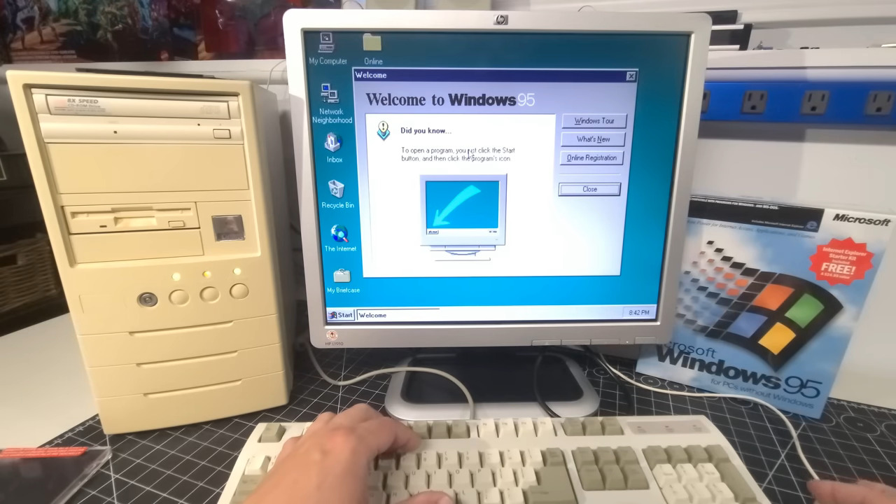
Over time it seems like a lot of designs stop feeling the need to lead the user in this way. There is an assumption that by now everyone knows what the menu in the bottom left corner does, and we are no longer in the phase of trying to teach the population to use a computer for the first time.
I feel like this is the wrong approach. Every day there are new young people using a computer for the first time. Wouldn’t it be nice if all these conventions that evolved over the past 50 years could be intuitively discovered, instead of needing explanations from someone who already understands them?
Of course, as the world becomes more digital, many skeuomorphic designs become more abstract to those same young users. The floppy disk, the traditional telephone, even the file folder.